UX / UI Redesign
Challenge: IKEA's mobile app had an identity crisis: it was a shopping app that didn't allow users to browse or purchase products. Our challenge was to design a cleaner, more user-friendly UX that would support IKEA's style-savvy brand.
Approach: Beginning with an analysis of the original app's heuristic problems, our three-student design team moved through user research, persona-building, scenario-mapping, and paper prototypes, all the way through to a final visual design.
The resulting app made it easy for users to purchase products, browse room layouts, purchase items, and track orders. Subtle changes to IKEA's corporate typeface lightened up the design while supporting brand identity.
My Role: Planned research; took equal part in wire-framing and testing; designed the product pages and alerts.
Note: This was a student-initiated project.
Design Research / Book Design
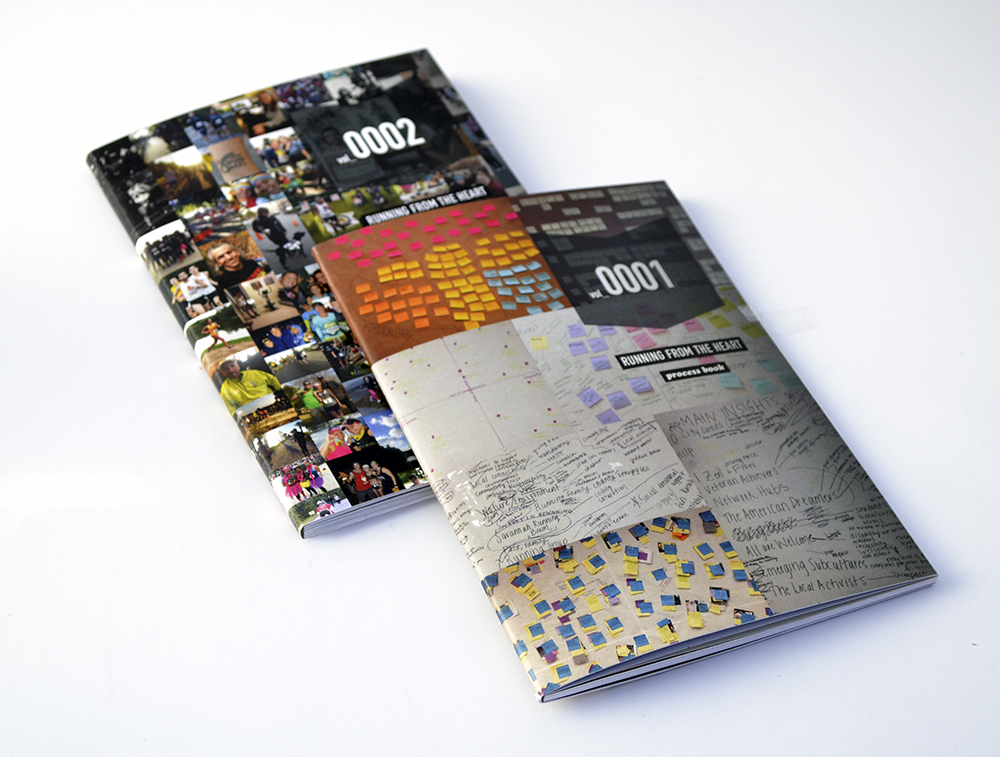
Challenge: Use applied ethnography to analyze Savannah's vibrant running culture and suggest solutions to local challenges.
Savannah has a large running scene for a city of its size, with 72+ races a year. Our 3-person project team set out to discover the secret behind the city’s running boom, applying contextual research methods like fly-on-the-wall observation and stakeholder interviews to identify key insights and drivers. The final deliverable was a digital presentation and process book. Later, I independently expanded the presentation into a 70-page booklet and matching process book, which our team presented to local running leaders. Our findings were used by fellow SCAD students, who used our insights and "passport" concept to design a Savannah running app.
My Role: Research, Book Design
Concept / Package Design
Challenge: Translate a familiar fairytale into a design concept for contemporary audiences.
This project stressed unorthodox methods of ideation. I focused on a fairytale theme and connected Hansel and Gretel to the contemporary issue of online privacy. The result was a keyboard cover that played on the “command” key, as well as the cover's protective function, to encourage college students to safeguard their digital data.
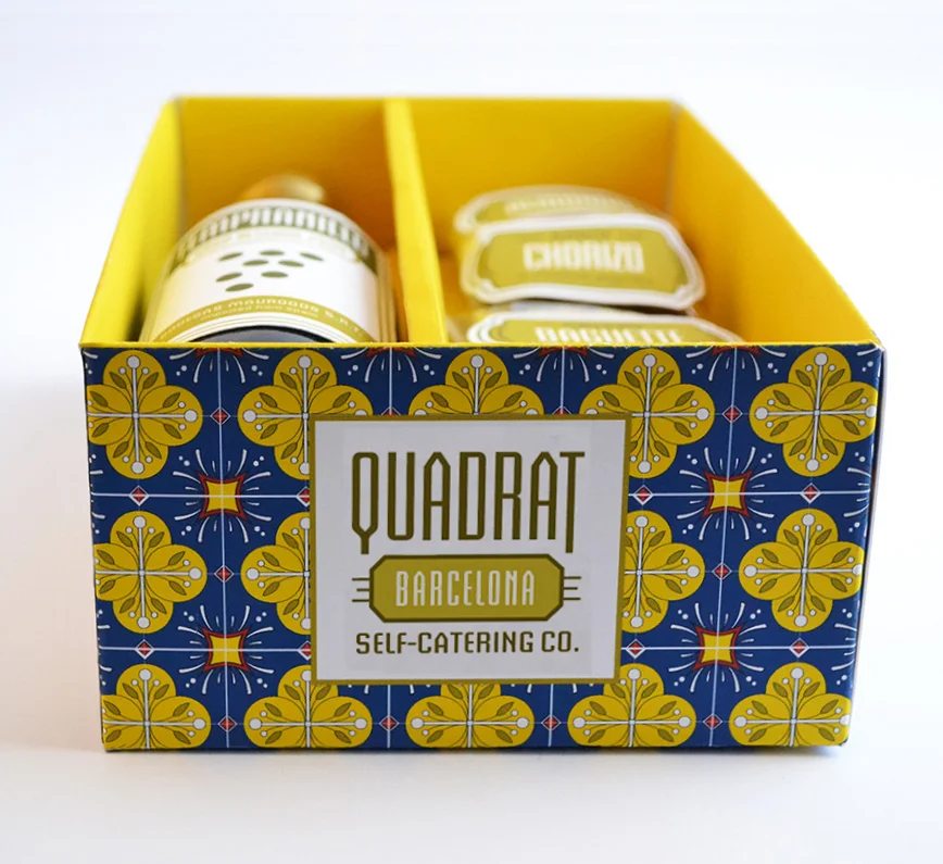
Challenge: Reimagine the everyday lunch
Conceived as a series of grown-up “lunchables”, these sophisticated sampler boxes offer an affordable yet utterly indulgent escape from ordinary lunch routines. Each pairing combines varietals from a different European city (Barcelona, Provence, Vienna, and Florence) with local cuisine samples, allowing the flavors of that region's terroire to shine through.
Concept / Branding / Package Design
Event Collateral Design
Challenge: Create an eye-catching visual theme for Bizet’s classic opera, Carmen.
This project features a warm color palette and cubist figures. The central image references Picasso’s Guernica, a painting about war, in order to evoke the destructive nature of Carmen’s relationship with soldier Don Jose. The conceptual process involved analysis of the original opera and its 20th century interpretations, including the 1954 film Carmen Jones. Inspired by Saul Bass’s original poster for that film, I incorporated retro touches like airbrush shading, a cowboy typeface, and halftone dots. Applications include Met Opera tickets, a VIP invitation, and subway wrap.
Concept / Branding / Package Design
Challenge: Design energy bar concept, branding, and packaging.
For this project I produced the concept and package design for GojiBar, a “real food” energy bar combining dried fruit and nuts with goji berries, nature’s superfood. Aimed at health-conscious shoppers, the logo references yoga with sanskrit-inspired lettering. The package was designed to identify as an energy bar while holding its own with a wide variety of brightly packaged competition. Transparent wrapping allows consumers to see this bar’s natural ingredients for themselves.
Branding / Package Design
Challenge: Design a fun, unique food truck brand that will attract local college and high school students.
This is branding project for a food truck specializing in bubble tea and steamed Chinese buns. Boba + Bao delivers tasty, nourishing snacks and creamy, authentic Taiwanese-style milk tea to a range of locations, with a focus on campus buildings located in so-called “food deserts”. I conveyed the brand’s key attributes – flavor, fun, and authenticity – using a playful design inspired by Taiwanese café culture, Japanese kawaii (cute) stickers, and washi tape. A boy and a girl, representing bubble tea (boba) and buns (bao), are followed by the tag line “better together”, while a candy-colored palette and hand-drawn patterns and type reinforce the design's young, DIY feel. Deliverables include truck wrap, packaging, and a responsive website.
Type Design
Challenge: Design an original OpenType font.
Inspired by vintage script, this display font was created by hand sketching each letter, scanning and tracing the entire alphabet in Adobe Illustrator, and kerning in Glyphs.
Booklet Design
Challenge: Design a booklet about one of Savannah's squares and publish print and digital versions.
This project was conceived as one in a series of booklets introducing Savannah’s 24 squares. This was a two-part assignment for SCAD’s Production Design course, and resulted in a print as well as a digital version designed using Adobe’s Digital Publishing Suite. The print version included a tear-off postcard for tourists to send home.